I like to make photo books from my latest travels to relive the experience, and a few weeks ago, I decided to take part in a product test for Saal Digital. The company offers software for creating a personalized photo book. In this article, I want to give you my experience with the design process and some tips for making your new book better.
Overview page

I usually start my photo book with an overview page. Half of it contains a map where I show the route. I use travellerspoint.com for this as it allows to select different travel modes like by foot, car, or plane. It also allows to overlay multiple journeys and calculates some statistics for the user. The other half of the page contains just text. I include the travel schedule outlining the things I did each day. Sometimes I also like to add statistics, like the distances traveled or the number of countries I visited.
Layout

Saal Digital offers many predefined Layouts, but unfortunately, most of them are childish and not optimal for my minimalist style. Luckily they provide an option to save self-created Layouts so the user can apply them for other pages. I made photo books from three different providers, and this is a unique feature of Saal Digital. But still, Saal Digital should add some new ones in the future.
Style and Consistency

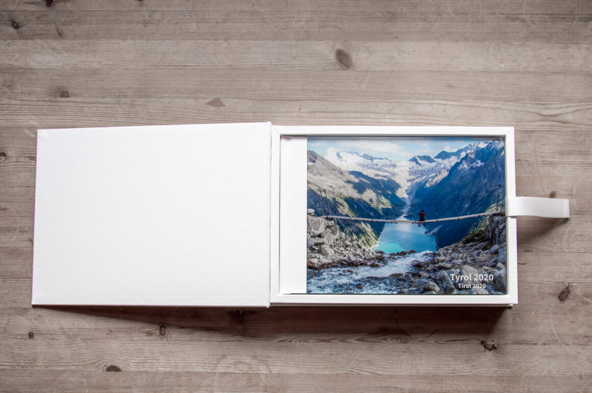
Highline179 
Krimml Waterfalls
I think consistency is essential for the final product. Because of this, I usually stick with one color scheme. This includes background and text. As I already stated above, I like a minimalist style. Therefore, I stick with black and white. Either I will have a light background and a dark font or the other way around.
The text should also stay consistent over the whole book, which includes alignment, font, and size. I usually stick with one simple font. In this book, I use one text size for the Headline for each page and a second size for the caption. Also, in this book, the alignment for the text is standardized. The page headline is on the top right, and the caption is on the left bottom of the individual picture.
The color scheme of the picture should also be similar. For example, the sky should have at least a similar color on the double page. Sometimes going black and white also gives pages a unique look, which makes them stand out.
Conclusion
I am delighted with the finished photo-book quality, but the software still has room for improvement for future versions. I hope some of the tips can help you.
Thank you, Saal Digital, for the great product.